Overview
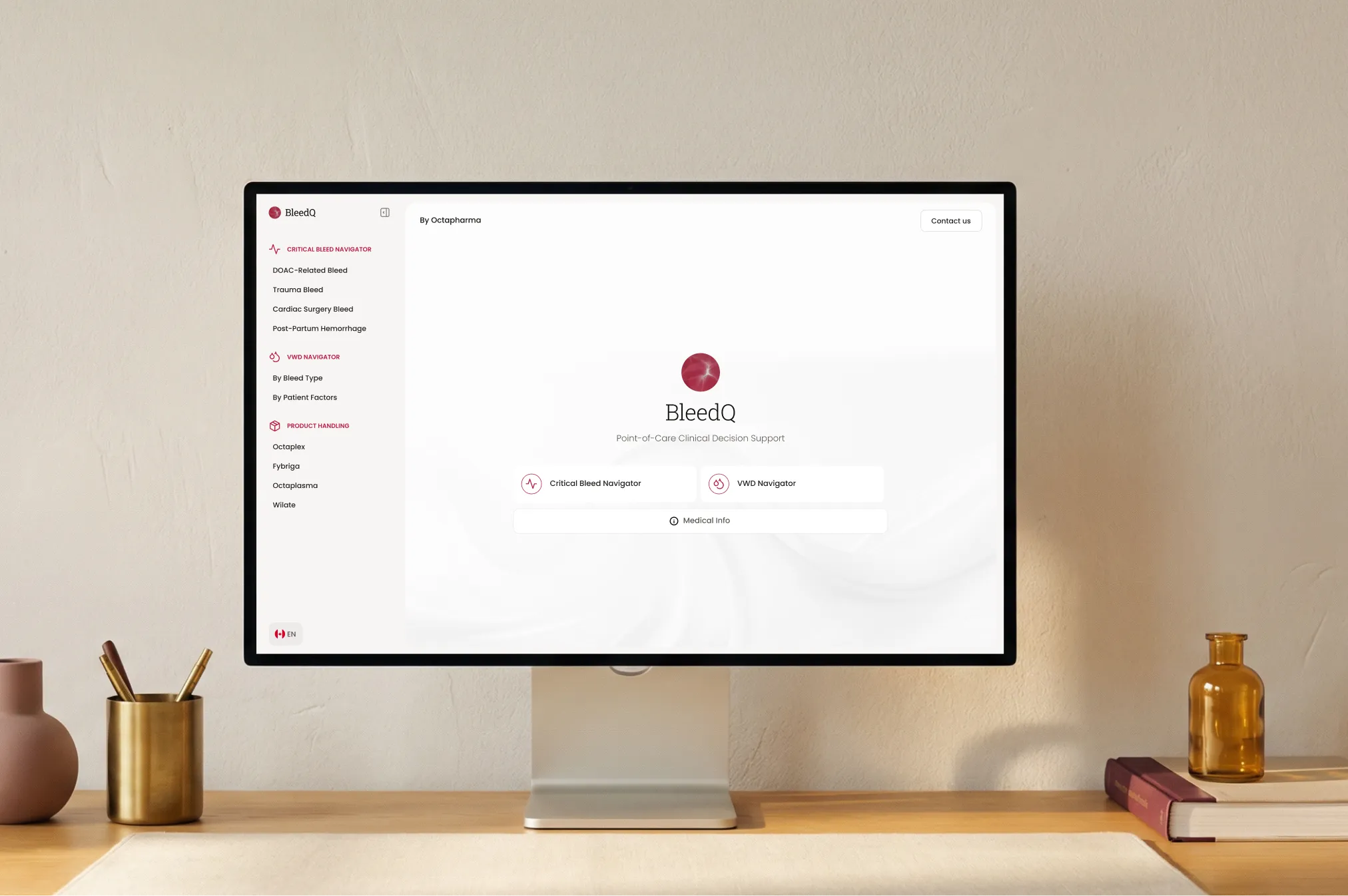
BleedQ is a point-of-care clinical decision support tool for Canadian healthcare professionals managing critical bleeding events.
I led the end-to-end redesign of the interaction model moving from a traditional progress-bar wizard to a chat-based guided navigator, and building the full design system for handoff to development.
Challenge
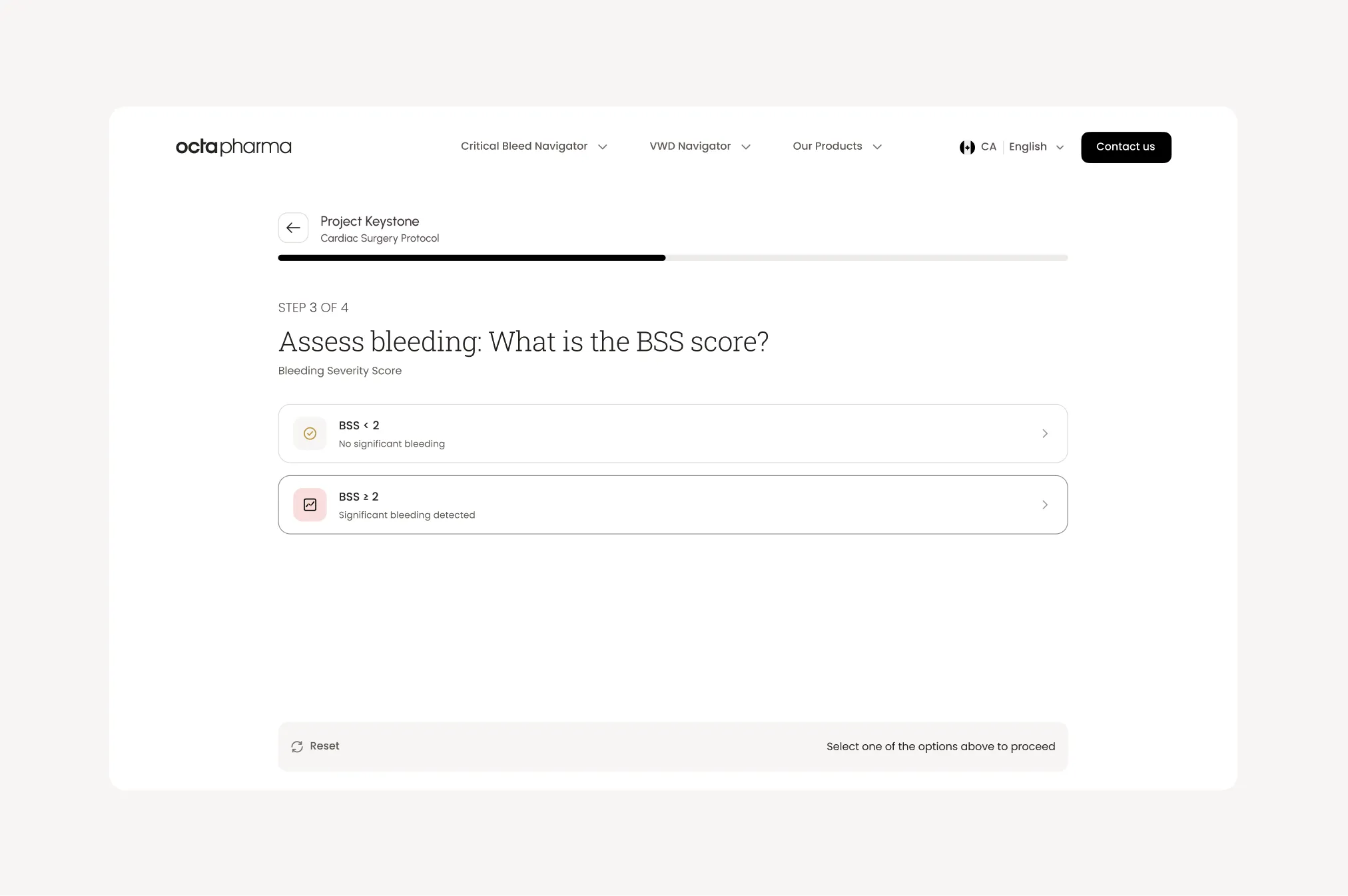
The V1 design used a classic progress-bar wizard: four full-page steps, a persistent stepper, a Continue button at the bottom. It was logically correct but experientially wrong for clinicians who need answers in seconds, not screens.
Full page load per question
Each answer triggered a navigation event. Clinicians lost context: they couldn't see their previous choices or what was coming next. The thread was invisible.
Progress bar created the wrong kind of pressure
Users rushed through steps to reach the result. Clinical content: dosing notes, conditional warnings was skipped. The design that was supposed to guide them was pushing them past critical information.
No path to the result without the full sequence
A senior clinician who already knew their patient's BSS score had to click through assessment steps they didn't need. There was no way to skip, no way to edit a past answer without starting over.
Client validation: "too many steps"
After user feedback on V1, the client's brief was clear: users need to reach a result as fast as possible. The wizard format was the root cause, not a symptom of something fixable within it.
Approach
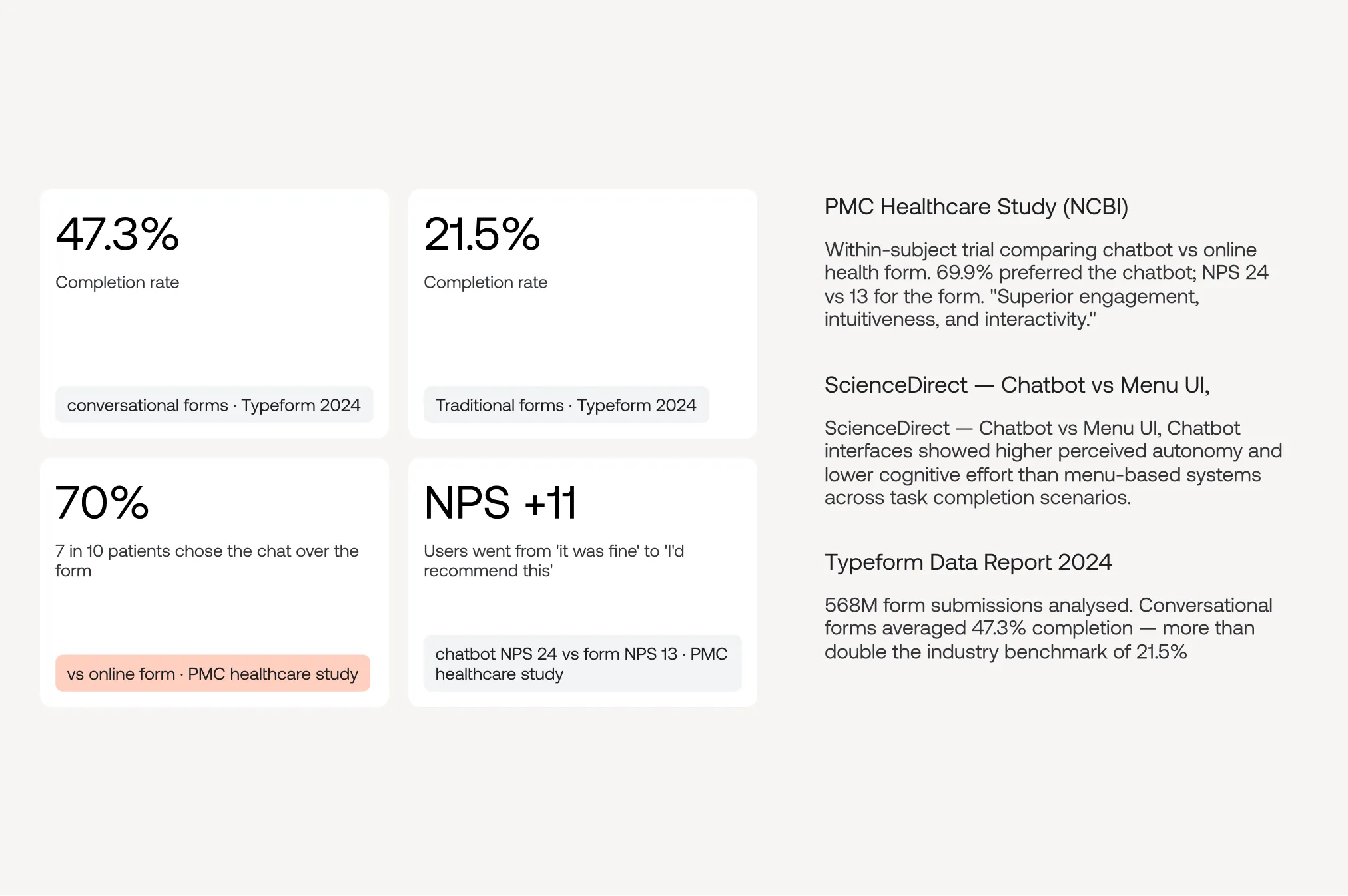
Before committing to a direction, I checked it against published research on conversational versus wizard-based interfaces in healthcare and enterprise. The pattern was consistent: conversational flows get finished more often and feel easier. A hybrid, structured options inside a conversation, became the model for BleedQ.
Solution
The client wanted AI chat and search, but that was planned for V2 and not technically ready. Rather than ship the quiz or wait, I proposed a guided conversational interface: it asks questions, responds with answers and visualized data, and feels like a chat, while running on controlled clinical logic underneath.
From flowcharts to conversation
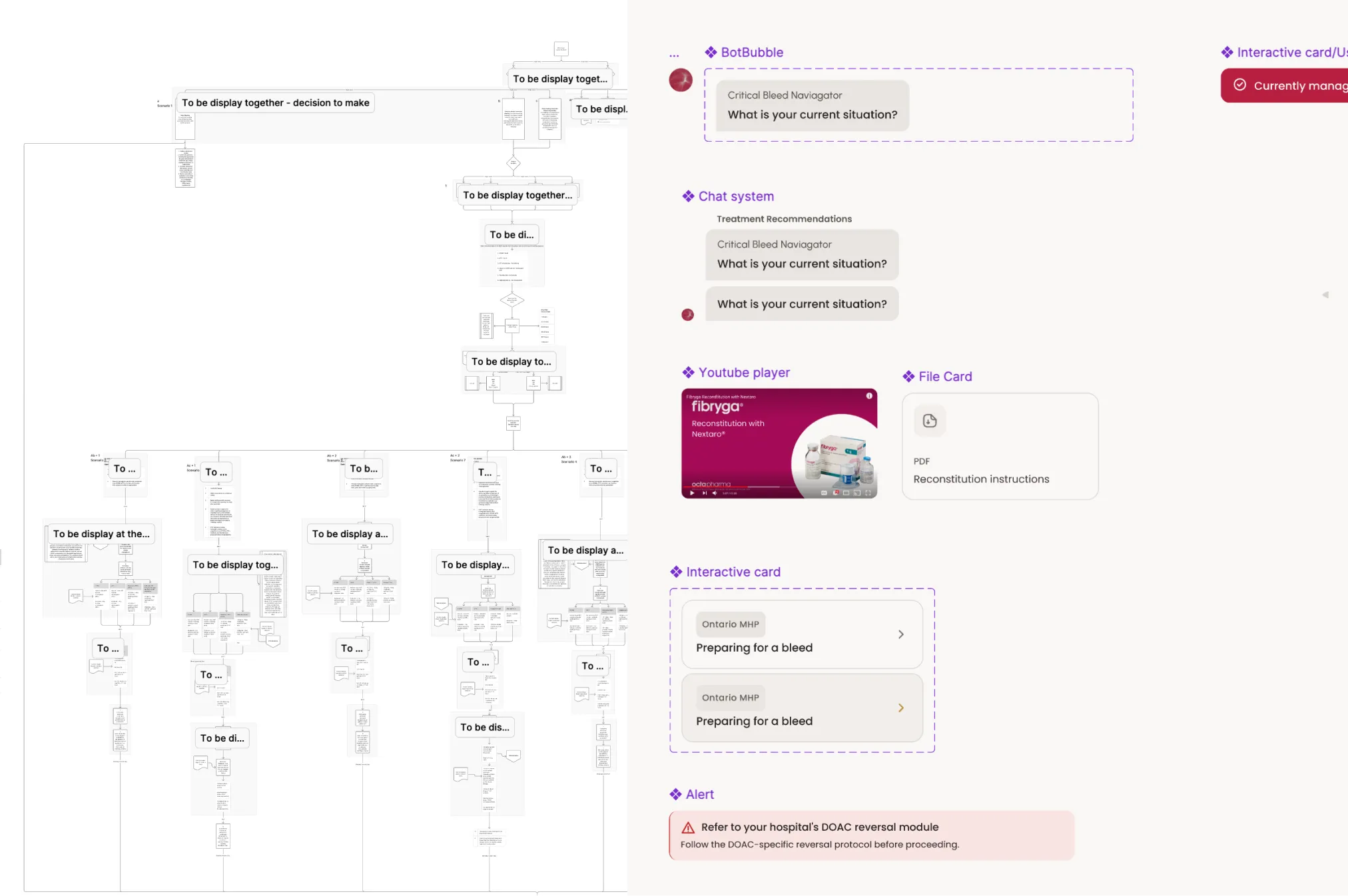
The client's clinical protocols were dense decision trees. DOAC alone branched into nine scenarios. I split each tree into two layers: the decisions became questions asked one at a time in the chat, and the outputs became data visualization components. Dosing tables, IF/THEN conditions, steppers for multi-step protocols, and notes for critical thresholds. Clinicians answer a few questions and get a structured, scannable result instead of reading a protocol.
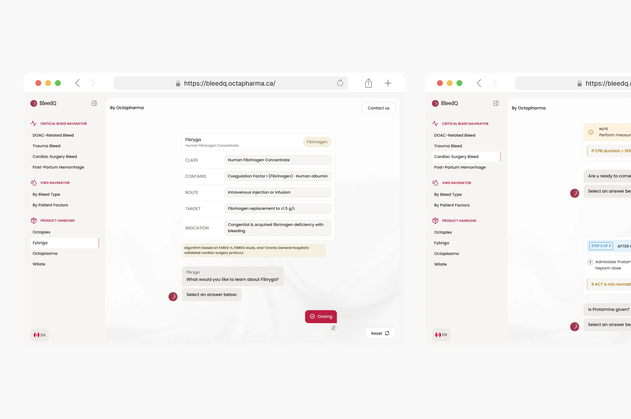
Functional prototype
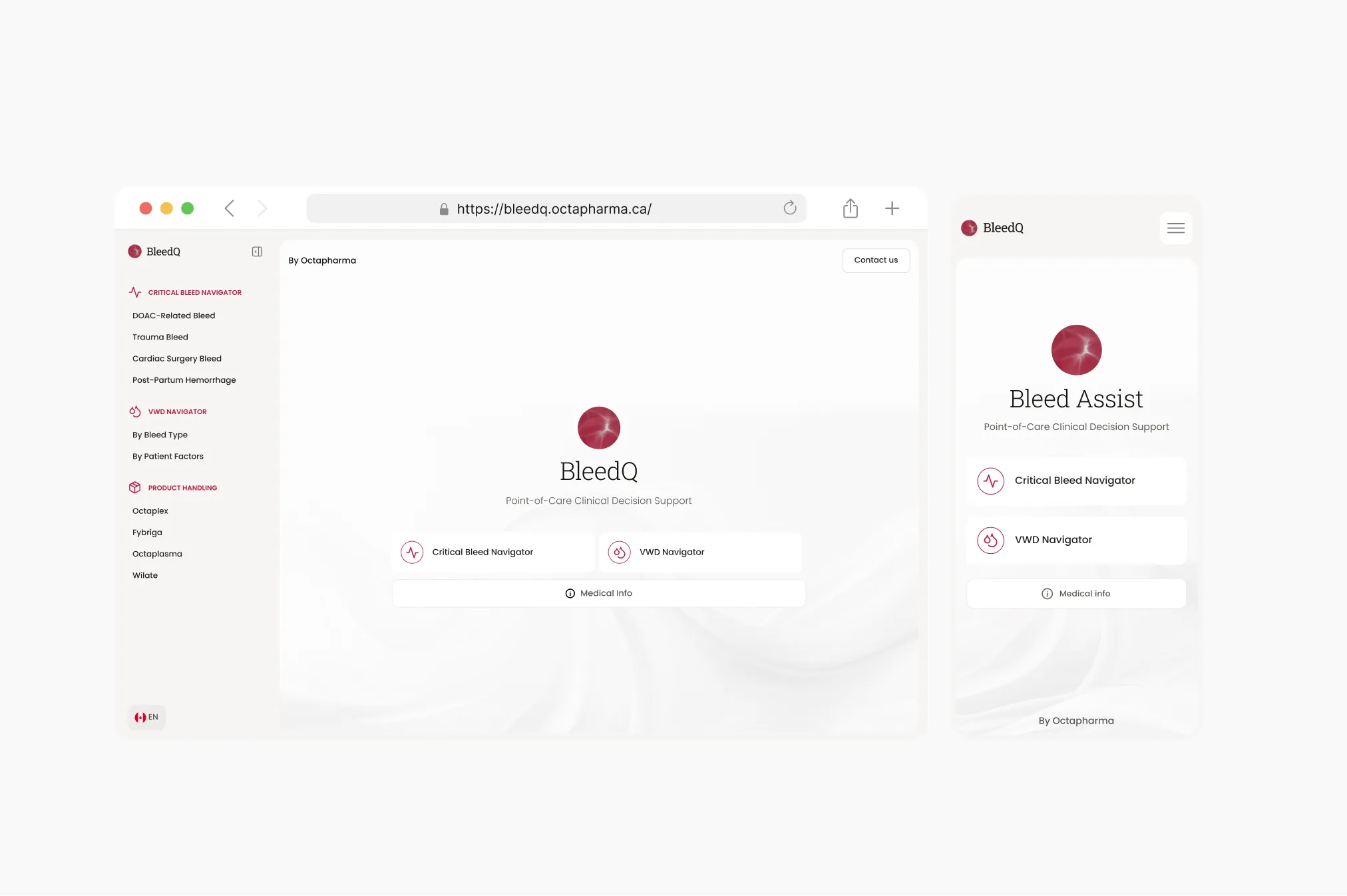
Instead of static mockups, I built a working interactive tool the client could use. It covers four critical bleed scenarios, a von Willebrand disease navigator, and product handling guidance, all running on the same guided conversational pattern. Clinicians and the client tested real flows from the start, which made feedback concrete and fast.
Results
The client signed off on the guided chat direction and it's live. The approach landed well enough that they've committed to moving into V2 soon. The shell is already designed for it.
No usage data yet, the tool is newly launched and metrics are still being collected. The case study will be updated as data comes in