Overview
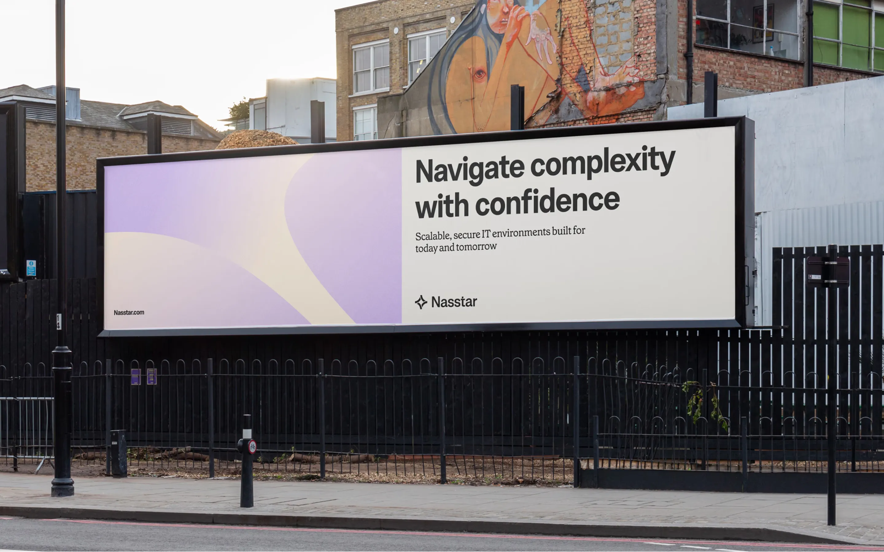
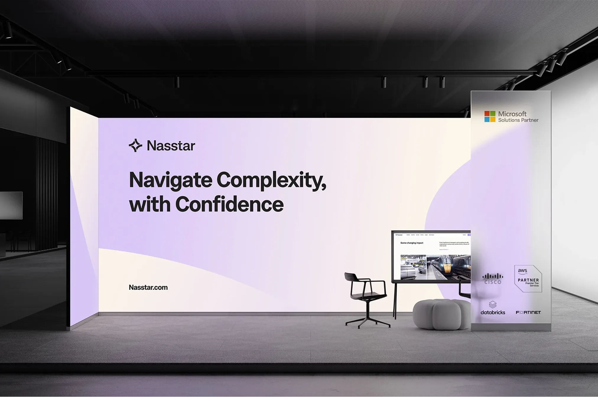
Nasstar is a UK managed services provider working across cloud, cybersecurity, digital workplace and communications. In January 2025 our team took on the full picture: strategy, messaging, visual identity, and the design and build of a new website.
I contributed to the brand work and led the website redesign end to end, from restructuring the information architecture through sitemap, wireframes and final UI.
Challenge
Nasstar had grown into a broad set of services, and the old site showed it. Everything was organised around the service catalogue, which works if you already know you need SASE or Azure Virtual Desktop, but not if you're a buyer starting from a problem or looking for proof they've worked in your sector. Visitors had to work too hard to figure out what Nasstar does and where to start.
The goal: a brand and site that still read as a serious tech partner, but felt clearer, warmer and easier to act on.
Approach
Nasstar offers a lot: seven service areas, over 25 individual offerings, and clients across ten industries. The challenge was making that breadth feel navigable instead of overwhelming.
The core decision was to stop assuming everyone arrives the same way. A CIO dealing with an ageing network, a public sector buyer looking for NHS experience, and an IT lead who already knows they need SASE are all looking for the same company, just from different starting points. So I structured the site around three entry points:
- Solutions (the problems we solve): outcome-led paths like future-proofing infrastructure, moving to the cloud, or delivering an AI customer experience
- Industries (who we help): split into public and private sector, from local government and education to banking, manufacturing and logistics
- Services (how we solve it): the full technical catalogue, grouped into Microsoft Cloud, Modern Work, Data & AI, Secure Infrastructure, Cybersecurity & Compliance, Digital Engineering and Managed Services
Each path leads to the same services, so visitors get to the right answer whether they think in problems, sectors or products.
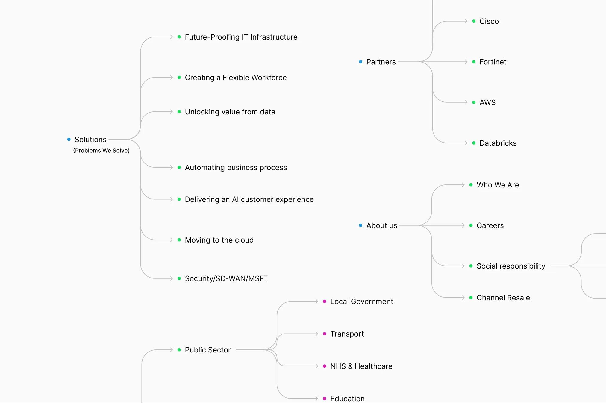
The sitemap maps those three paths alongside Insights, Partners and About. Services go up to three levels deep where the product demands it (Microsoft Teams Phone, for example, breaks down into Direct Routing, Operator Connect and Teams Contact Centre), while everything else stays shallow so visitors are never more than a couple of clicks from what they need.
Supporting sections do their own jobs: Insights builds credibility through industry trends and case studies, Partners shows the Microsoft, Cisco, Fortinet, AWS and Databricks relationships buyers look for, and About covers culture, careers and social responsibility.
Low-fi wireframes let us lock hierarchy and page logic before any visuals came in. I built a set of reusable page templates homepage, service hub, service detail, case study, contact and tested the flows with stakeholders to make sure the most common journeys took the fewest clicks.
Solution
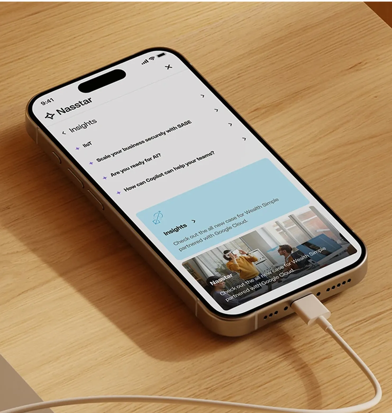
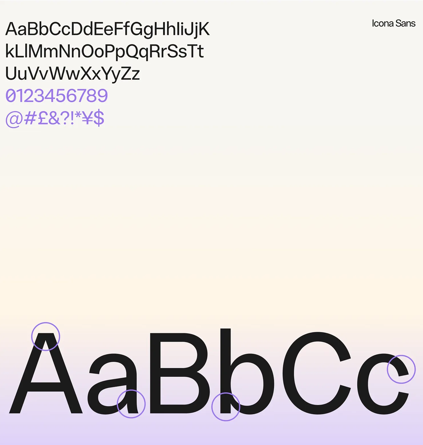
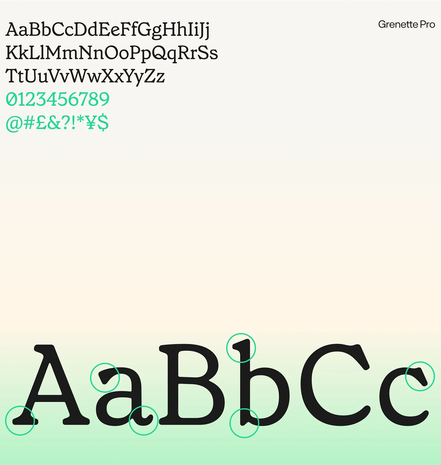
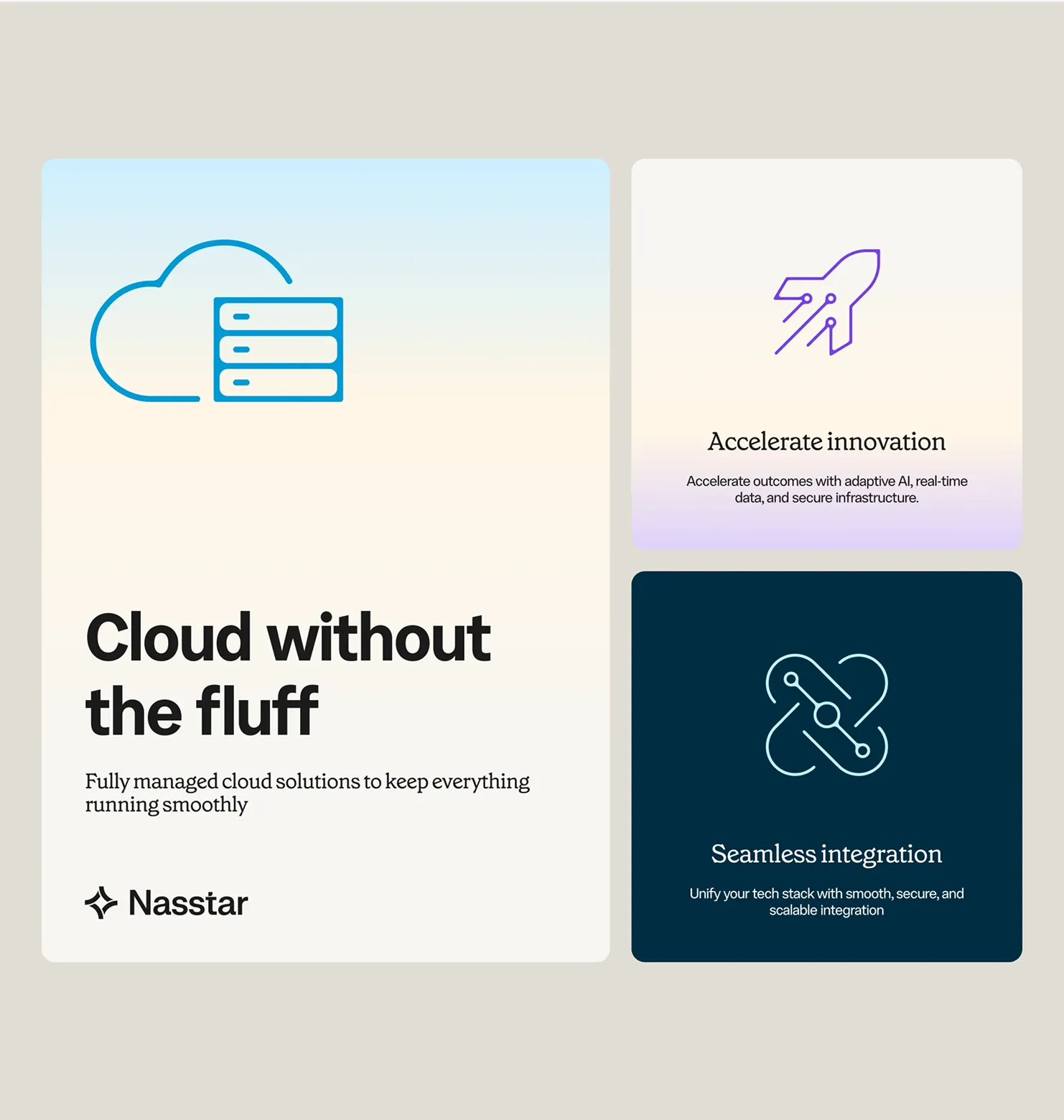
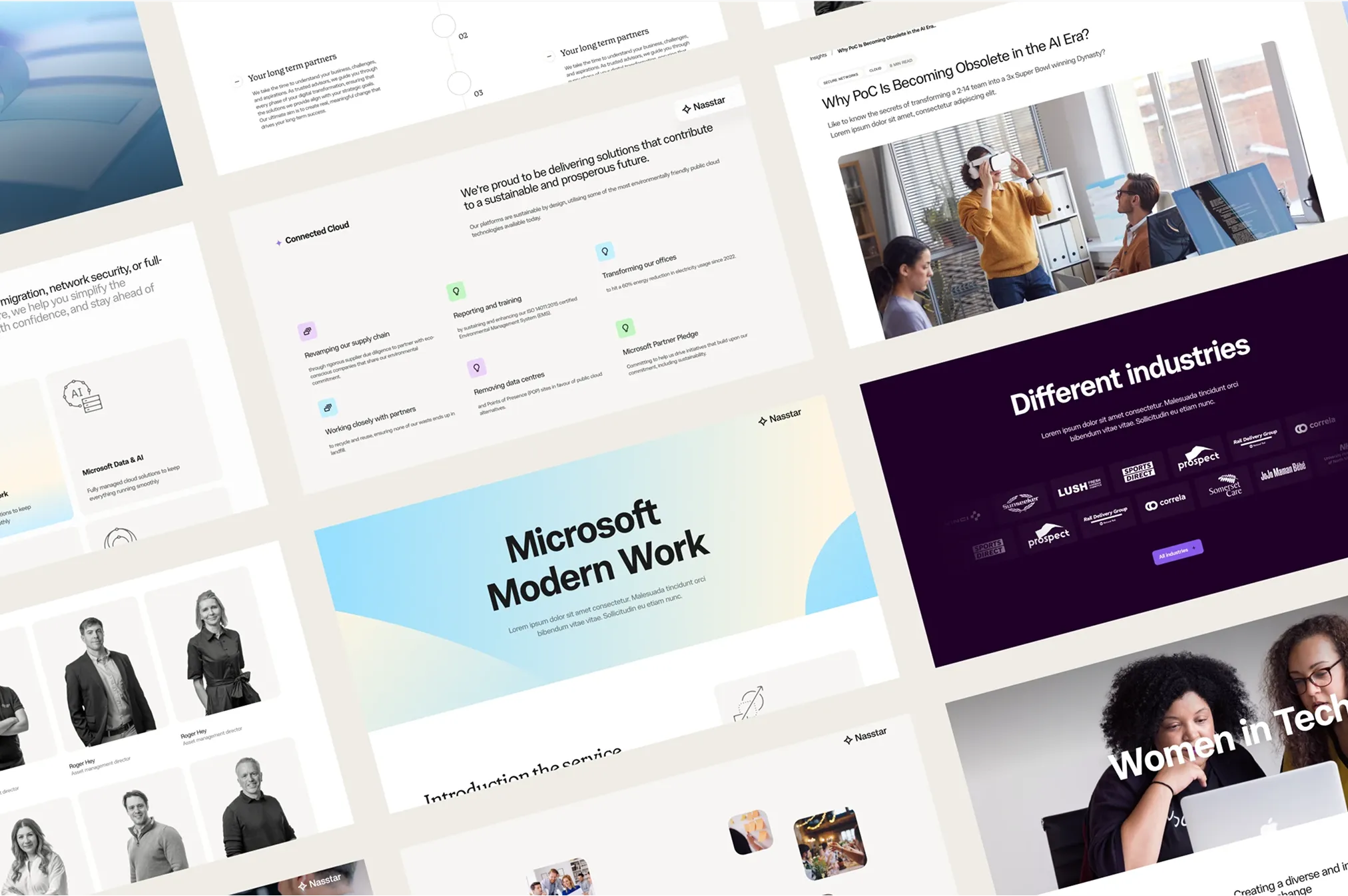
The final UI brought the new brand to life on the web. Service colours act as wayfinding, so visitors always know which part of Nasstar they're in. Pictograms break up dense technical content, and a warmer, more conversational tone replaced the usual IT jargon. In short: we kept the brains of a serious tech brand and turned up the personality.

Results
The platform launched for a select group of clients in Canada in 2024. BMO became the first bank in Canada and the United States to win the Red Dot Award: Design Concept in the Interaction, UI and User Experience category, and the only Canadian or U.S. bank named to Fast Company's World's Most Innovative Companies that same year. Building the platform had also made something clear: to get this right across BMO's entire product ecosystem, the foundation had to come first.